W4_Hassan Albarrami_Pareto Chart
1. Problem Definition
Oman is a developing country and infrastructural projects are increasing sharply. One of the main projects in Oman are the roads , unfortunately Oman is suffering from road accidents as the statistics for 2012 shows that one case of injury every hour due to road accidents and one death was reported every eight hours due to a crash. In this blog we need to identify the locations in which the most accidents happen so that more road resolutions to be exerted.
2. Identify the Feasible Alternative
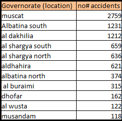
Table 1 is showing statistical road accidents in Oman according to historical data form 2012.
Table 1
3. Development of the Outcome for Alternative
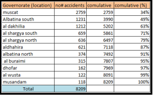
Pareto chart will be applied here to find out which location need first attention. Pareto chart contains both bars and line graph in which values are plotted in descending order of relative frequency from left to right.
Table 2. Locations that leading to majority of road accidents
4. Selection Criteria
Locations which if tackled will reduce 80% of the problems.
5. Analysis and Comparison of the Alternative
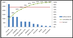
Figure 1. Pareto chart analysis
Figure 1 shows that maximum accidents are in Mascat where as minimum accidents are in Musandam
6. Selection of the Preferred Alternative
According to figure 1, the company should focus only on top 5 locations below:
Table 3. Top 5 locations which need government attention to reduce accidents
If the government solve the road problems in these locations, it means the road accidents will be reduced by around 80 % .
7. Performance Monitoring and the Post Evaluation of Result
The government to start working on those top 5 locations and to apply the same method every sex month so that new locations can be tackled.
Reference
- Gulfnews.com ,Oman traffic accident rate tests health sector,Retrieved on 23.06.2014 from http://gulfnews.com/news/gulf/oman/oman-traffic-accident-rate-tests-health-sector-1.1193524
- Bright hub pm, Creating Pareto Charts With Microsoft Excel, Retrieved on 23.06.2014 from http://www.brighthubpm.com/templates-forms/8708-creating-pareto-charts-with-microsoft-excel/
- LAKSONO, A. (2014, June 17), W16_AL_Pareto Chart | Kristal AACE 2014. Retrieved on 23.6.2014, from http://kristalaace2014.wordpress.com/2014/06/17/w16_al_pareto-chart/


Hi Hassan,
I am going to reject your W4 posting for the same reason I rejected Asma’s….. I BELIEVE that you are interpreting Pareto incorrectly.
As I understand Pareto, the objective is to always be focusing on the top 20% ONLY, not on the top 80%?
Here are my references:
http://www.mindtools.com/pages/article/newTED_01.htm
http://www.pinnicle.com/Articles/Pareto_Principle/pareto_principle.html
http://www.clickz.com/clickz/column/1716017/the-pareto-principle-applying-80-rule-your-business
As this question is almost GUARANTEED to show up on your PMP exam, it is important that everyone in the class is very clear on exactly HOW to apply this very useful principle….
BR,
Dr. PDG, Dubai Int Airport, on my way back home to Jakarta
OK DR .I will revise it today thanks and regards